
High and low key approaches could create suchfeelings, moods and impression by using this idea which is often used in fashion photography or b/w photography. A high key photo could be described in using bright colors, a soft lighting and reduced contrasts. A low key photo can be described by using dark colors, a harder lighting and stronger contrasts. I low key you often find large areas which appear almost black.
High Key
With the bright colors, the soft lighting and the reduced contrasts you can create a friendly mood. Impressions like sunny, soft, friendly, cozy, smiling, bright, airy, light come to mind.
© All rights reserved, Thorsten Kraska, 2010
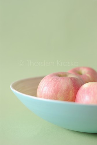
In this one I have used a very simple composition: apples in a bowl against (cropped on right side) and a light green background. The light is coming from left through a window and was smoothed by a sheer curtain. So, I could get a soft light without to harsh highlights. When you take a look at the highlights on the apples they are bright but the borders of the highlights are soft. To get the image brighter I have overexposed the image. I tried different setings of getting the image as bright as possible without creating blow outs in the highlights. Although blow outs are used in high key shots, I think that in food photography one should use blow outs carefully. Here I wanted definition in the highlights too.
The colors have almost the same brightness and saturation so that the contrast are reduced. I was using the color triangle of a broken red, blue and green. This can create a happy impression and is not as active and dominant as the primary triangle of red, blue and yellow.
I cropped the bowl on right side. One could say I cropped the shadow side of the bowl and so I cropped out some of the contrasts which would have occured in the shaded area. For the apple on left side I used a fill light from upper right to reduce the shadows on the right side of this apple.
To make a softer appearance I used a more shallow Depth of Field.
Why I used a high key setting here? The color of the apples (variety 'Fuji') are of a lovely bright red to pink with some yellow notes. They are not overly sweet and have a 'light' taste with fresh fruit notes. So color and taste were the reason to go with a very bright setting, which creates a sunny, light and friendly feeling.
Low Key
With the dark(er) colors, a hard lighting and the higher contrasts you can create a more subdued mood. In stills you can even create the mood of old paintings. Impressions like evening, rustic, subdued, homey, earthern, heavy come to mind.
© All rights reserved, Thorsten Kraska, 2010
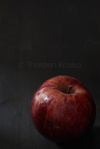
As soon as I saw this apple (variety 'Red Delicious') I knew that I would use a low key approach here. The texture and coloring of the apple is very picturesque and reminded me a bit of apples you can see in still life paintings. The surface of the apple is very unique, indvidual. So I just wanted some light on the apple to highlight this structure but want to leave the empty space more or less in darkness. Because a plain black or dark background would give an artificial look, I used a dark wooden board for some structures. And the wooden backdrop is emphasizing the rustic character in this photo.
In contrast to the high key photo above I used flags to exclude light and to direct it. The light is coming from upper left side from a window. I didn't smooth it here. You can see that the hightlights are strong and have much sharper borders than in the high key photo. A black board (flag) was placed on the right side of the apple so that no light could be reflected to the right side of the apple. I wanted tto keep it in the darkness. There is also a flag on upper side of the photo to keep the back more in the dark. To direct light and to create a smaller, more visible, beam of light I use two flags on left side (black boards) to narrow down the light as much as needed. A bounce from upper front is giving a soft fill light on the apple to highlight a bit the structures of the apple surface.
High & Low Key
In the two examples above the food gave me the idea to use a high key or low key approach. But you can use the same food to create completely different food photos.
© All rights reserved, Thorsten Kraska, 2010
© All rights reserved, Thorsten Kraska, 2010
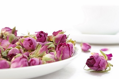
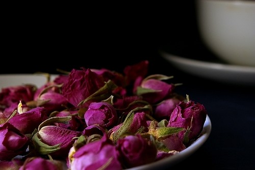
In these two photos for rose tea (dried rose buds)I created a complete different mood in the high key shot (3) and the low key shot (4). Although you can compare the settings, which are very similar, the mood and impression of both is very different.
I like both photos for different reasons. The high key one for its very airy feeling and the brightness, which is creating a very clean impression. The low key one is highlighting the wonderful color of the rose buds. Against the dark background the color is standing out well. To break the plain black of the background I have placed a cup in the back. This is adding orientation and dimensionality. Without the cup in the back it would have been to artificial. I could have placed some buds on right side of the plate for that reason too but I wanted to keep the photo as simple as possible. In the high key shot (3) I have some rose buds on right side of plate to structure the white a bit more. Otherwise I would just have an area of color against a white background.
High and Low Key Photos are maybe more "extreme" concerning lighting and contrasts, but they give you the chance to play around with mood in your food photos. And they give you the chance to train yourself in lighting and how to use light. In photography it is very important to know the basics of lighting and to train your skills.


17 comments:
Merci pour tous ces tutos très utiles!
Very useful article! Thank you very much!
Thank you both for your feedback.
Great article Thorsten and very useful information on the difference between high and low key shots. I absolutely love that dark apple photo as that apple is truly unique! Your photo makes it shine like a old master painting!
Thank you so much Simone for the compliment on that apple shot.
I am loving your series of posts on photography. They are extremely helpful. Thanks for the full explanation on how you took the high key apple picture.
Thank you so much, Thorsten, for this great tutorial! I enjoy all of these shots, but find myself drawn to the dramatic mood of the low-key photos. I've noticed just what you said about solid paper/fabric backgrounds feeling too artificial for dark shots. This is why I'd been searching (unsuccessfully) for a dark wooden board like the one you use. I'd appreciate any suggestions about where to find one. Thanks!
Sunshinemom, I'm happy that you find this post helpful.
Xiaolu, I often buy very cheap wooden boards and paint them with the color I like. Sometimes I overpaint them with a different color then. Just experiment around. It is much easier and cheaper to do it yourself.
Thanks for your post. :)
(I'm Esci_le_foto on Flickr)
BeepBeep, hope you find it useful.
Thorsten - you read my mind. I actually was going to email you a question on this:-) No need now. It's all here. Thanks!
Thanks Wizzy.
Wonderful post Thorsten! You managed to explain the differences between both styles perfectly.
Thanks Sari for the compliment.
Awesome article! I've been looking all over to learn how to create a more dramatic and moody look to my food photos! This is perfect, and I love how well you explained how you use black boards to subtract light. Your pictures are beautiful!
This is exactly what I was looking for! Thank you! Great post. Would you say that this picture, from the Cannelle de Vanille blog is high key? Is thats why it appears so... airy? http://news.sunday-suppers.com/wp-content/uploads/2012/07/EDOC9206.jpg
If you are looking for the professional photographer to have perfect clicks of food and drink then just contact with a great food photographer. Get in contact with Maini London to world best food photography in London
Post a Comment