© All rights reserved, Thorsten Kraska, 2009
The final shot
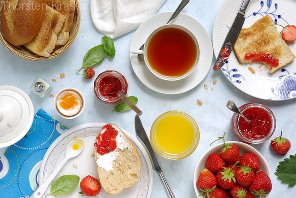
I did the shooting "Breakfast with strawberry jams" a while ago. Above you see the final shot of this series. The idea behind this was to give a certain feeling of a sunday morning. You know breakfast table is ready, everyone has it own favorites, one likes coffee, the other one orange juice. One likes this jam, the other that. And in the midst of the breakfast table there is a chaotic mix of everything. And did you notice, that also for the table ware everyone has a favorite one. So, I wanted to create a a "typical" breakfast scenery, most of us will know, but giving focus on food. So, only jams are used (with exception of the egg).
This kind of photo can be very busy looking. So, I reduced the busyness. The dominating background color is blue (table ware, napkin, backdrop). I used only red jams. So I just have a few "repeated" colors, which are dominating
At next I repeated elements, although they are a bit different. You see the crumbs of bread below the right plate are repeated by eggs shell crumbs on left side. Basil leaves are repeated by strawberry leaf on far right. Toast is repeated by bread roll. A sliced strawberry in upper right is repeated by strawberry with bite off. You will find many of the repetitions. So there is no single / stand alone element. Everything has a counterpart.
I used the bird's eye view to remove "perspective". Perspective would have been to dynamic here for me. And the graphical layout is balancing the differences in the elements even more. And so did lighting. Around the scenery I placed several bounces to get a balanced light.
And so the photo doesn't look too overcrowded. Everyone finds something familiar or well known in this photo (except for those of you who don't have or like sunday breakfast). What might have otherwise been too busy are becoming more of little details, which makes the photo interesting, Yes, this photo was arranged.

© All rights reserved, Thorsten Kraska, 2009
The Layout & compositional idea
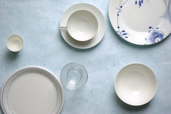
Above is a photo of the basic composition. For this composition I used lines and circles. The main lines are already there. Plates line in a diagonal position. And the vertical line of cup and glass. A problem from the startd: the plate in upper right is dominating over the plate in lower left. I started with this simple setting and developed the idea from here on.
Lines: diagonal line of plates and its counterpart made by basket and bowl with strawberries (with glass and jar in between). A strong vertical line of cup and glass slightly off center only to keep balance. And my favorite line: a horizontal wave line from sugar bowl on left, over salt shaker, egg, jar, spoon in jar, glass, again jar and the strawberry leaf on right. The spoons and knives are all using the diagonal orientation. These lines build a mesh, a structure for the elements.
Circles: the major element is in this composition the circle or dot.
The problem: the dominating plate in upper right. To break this, I used partner elements for the other plate: a colorful blue napkin. And the egg, which has no obvious counterpart in the photo. If you take a look at the pre-shot. The dominance is no longer there.
But such a photo needs something, you like to look at. Little details. I wanted hidden details, you have to explore. And every time you come back you should discover something new. You may wonder, if there is something not arranged: no. Every single detail is where I want it to be. And I checked it over and over again. Should the plate slightly cover the napkin? Should the spoons at the cup and the egg spoon have exactly the same direction? This kind of image is like a puzzle and the arrangement needs much much more time than the shooting. So, with so much time put into the arrangement, you will do shoot more than just one.

© All rights reserved, Thorsten Kraska, 2009
Outtake
The glass is such a lovely and strong element, that I wanted to use it. This is maybe a strange composition, because I have the glass almost dead center. This composition is anchored by the glass, everything else is placed around. It is in the center of every line in this photo: a horizontal line from one jar to the other, in the strong ascending diagonal line from lower left to upper right, and in the line from cup to bowl. And with that I have switched the focus to the orange juice, which is the dominating element here. And the brightness let fade out the blue to almost white. I used the blow out effect to reduce the meaning of the plate in upper right. And I used less fill light to get some shadows.

© All rights reserved, Thorsten Kraska, 2009
Another view on it
In this outtake I do not only change to the potrait format, but I get closer to focus on the jam jars. The spoons are used to get the viewer's attention directed into the jars. Plates in front and back are cropped hard to make them less important. The strawberries are used as a reference of what the jams are made of. Main viweieng line is from the bowl in lower left over the two jars into the background.
If you like this, you may like this one too:


11 comments:
I am so in love with this photo and keep coming back with more things I track on my mind. It's just lovely, I have to say it again! Keep inspiring me, TK!!
Love,
ab
Thank you Arfi for the compliment.
Thorsten, I took a few days just to stare at the picture at the top of the post, just trying to 'see' so that I can learn. It is beautiful. The colours pop but without being oversaturated. Did you use natural light for this? Did you have another light source other than the obvious one that is casting the shadow? I apologize for the baby questions. Only minor distractions with the composition for me were the touching knife and spoon in the middle. The spoon could have been angled a little more up from the knife to give some space between them. However I only saw that after a few days of looking :-)!
Hi Wizzy. Thanks for your compliment. The breakfast shot was done with natural light only. The light source is coming from top side (slightly from right). You can see it better in the other shots, where you can see the shadows and their direction. I have used white boards for fill lights, one from right side, another one from a distance from lower left pointing to the basket. And one from behind the at a distance to control shadows. There are always things I would have changed too. You are right about spoon and knife, I didn't see that. The imperfection is the driving force to make it better next time, although I konw I will make a different mistake then.
this shot is AMAZING!
It makes me want to have Sunday breakfast EVERYDAY!
this is really amazing, all of the carefully placed items, and the lights...
It's soo inspiring!! If you don't mind, can I put this on my blog? I'll direct it to you right away, of course.
Thank you for taking the time to go through your set up. I have learned so much form this shot! Feel flattered if I explore the concept myself soon: inspiring!
I love food and photography too, It´s so pleasant to see your beautiful work, very inspiring.
Thanks for sharing, I'll certainly try to do something like that.
So beautiful! I love your write up and explanation on the circles, lines and counterparts. What lens do you use for this?
Thorstein
I love the effect of the natural light. Great composition on those images!
I recently began shooting using natural light as well and really like the results.
Do you ever use a flash from behind when using natural side light?
Your portfolio on Getty is very impressive. You do great work!
Thanks George.
No, I don't use flash light. When I use artificial light I use photo lamps. I never mix the light sources until now. With natural light I'm using bounces and flags to diurect light as I want it.
Post a Comment